
Monday, October 11, 2010
Oh Bright Star
Wednesday, October 6, 2010
All About Elijah

Jodie contacted me a few days ago and wanted a blog makeover in red, black, and white (they are precious in his sight LOL). This is my first design using pictures. But she sent me these two adorable pictures (aren't the sock monkeys to die for). I was nervous about using pictures for the first time, but I really love how it turned out. It may be my all time-favorite blog design so far, but I think I say that all the time. So lets just say it is my current favorite. Until the next one comes around.
Sunday, October 3, 2010
Tk's Bowtique

I used some ribbons and flowers to give it a crafty look, and just thought the butterflies would be a nice touch. I created her post divider on my own , as oposed to just finding a matching divider. And I love it. I also made little pink buttons for her navigation bar.
Be sure to go and check out Tara's blog!
Saturday, September 25, 2010
Little Houses-Pre-Made Layout

(Click on Image to See Live Preview)
I wanted to do a really simplistic, clean, and non-pink layout (non-pink is soooo hard for me, don't worry the pink will return soon enough). I wanted to make the header and the background of the layout look like they were connected, so I used the turquoise wallpaper for both. I played around with the drop shadow on the elements (the house, tree, etc) to make them look a litle more 3D. I installed a custom font for the post, date, and sidebar title. Lastly, isn't the advertising button I made for this design super cute? I think it is the cutest one I've ever done. Its looks like a postage stamp! As always, if you purchased this layout I would replace the title "Little Houses" with your blog's title (as well as the other personalized elements).
I think the layout little houses could be used for so many different kind of blogs. To learn more about pre-made designs go here. To purchase e-mail me at brittanyervin86@yahoo.com.
Friday, September 17, 2010
Adam & Brittany

This blog design started out being Pink. Surprise, Surprise. But then I thought Adam wouldn't appreciate the pink, and I needed to break out of my pink comfort zone (which is hard, I LOVE PINK!) So I decided to do a brown theme. I love the brown paper wrapper feel of it as well. In the banner, I used a lot of homey elements like bird houses, white picket fences, and weather veins.(And I had to mention something about our dog Sarah!)
I made a custom navigation bar with pages to info about us, our wedding, and our honeymoon (yeah, yeah gag you with a spoon, I KNOW. Our love sickens me too). And I used fun little paper strips for my side bar elements.
Some reason internet explorer is cutting my paper strips off and making them square, this makes me kind of sad. So view it in firefox people!
Tuesday, August 31, 2010
Tutorial: Removing/Changing the Border Around Images in Blogger Pt. 1

Remove the Border
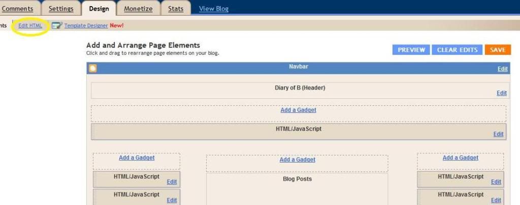
Step 1 and 2-Go to blogger's main page. Click the design tab under your blog's name (shown in pic 1). Then click the edit html tab (shown in pic two).
Picture 1
 Picture 2
.post img {
padding: 4px;
}
Option 2-
img{ padding: 4px;
}
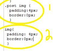
Picture 3
Step 4- Once you find the applicable code copy and paste "border:0px;" (without quotes) between the semi-colon and the } symbol. The end result should look like this (step shown in pic 4):
post img {
padding: 4px;
border:0px;
}
Or this:
img{ padding: 4px;
border:0px;
}

Picture 4
5. Save your layout. That's it.
Thursday, August 26, 2010
Jana K.

(Click on Image to see Live Preview)
I did this make-over for one of my best friends and former college roommate, Jana. Being that we are so close and I know her so well, figuring out what she wanted was super easy. She is obsessed with the 80's. She loves the music, fashion, and color schemes. So she told me that she wanted zebra print and bright colors! So I gave her what else but zebra print and bright colors!
I made her blog title Jana K using my previously made and featured Autumn alpha by recoloring it. I found a really, really great blue and green design kit for the elements. I colored her background with a nice light blue and added a pink border. This layout is pretty simple but really, really fun.
So go check out Jana's blog, she is the best friend a girl could have. Love you chickadee!
Tuesday, August 24, 2010
Hey There Delilah-Pre Made Layout

Click on Image to See Live Preview
Hey There Delilah is my new favorite design. I had the idea that I wanted to do an atypical blogger layout. One that didn't have visible designated sections. Like you can't see where the header ends and the post area begins. Everything is just floating in a sea of black. Lame analogy, I know! This layout would be great for anyone living in the city, or anyone who just loves the city. Although I think it can be used for a variety of purposes.
I named it Hey There Delilah because that is one of my favorite songs. It was mine and my husband's song when we were in a long distance relationship, and it just reminds me of my own life as a country bumpkin turned city girl. To learn more about pre-made designs go here. To purchase e-mail me at brittanyervin86@yahoo.com
Thursday, August 19, 2010
Pre-Made Layout-Paparazzi

(Click on Image to See a Live Preview)
I created Paparazzi during my three day internet drought. Believe me, I had nothing to do but fool around with photoshop. But I love fooling around on photoshop, so I didn't really care. I didn't have any inspiration for Paparazzi ,except that I wanted to do something bright and fun. I added pops of color all over the layout and used a mesh mash of different things in the banner. The banner really reminded me of Lady Gaga for some reason. So that is how I came up with the name Paparazzi (after one of her songs). Since I came up with the name Paparazzi, I've had "Ra Ra Oh Ma Ma, Ga Ga Um Ba Rar,"stuck in my head. Which isn't even the correct song. Nope, that song is called Bad Romance.
I've used the effect of having different colored sidebars in the past. But it is an effect that I really love. It just makes the sidebars stand out a little more. I used a little creased heart for the sidebar titles and the favicon. I also really love the button I made to match this layout. I think you guys would really have a lot of fun with this layout. To learn more about pre-made layouts go here. To purchase or ask questions e-mail me at brittanyervin86@yahoo.com.
Wednesday, August 18, 2010
Pre-Made Layout-Autumn (plus free alpha)

(Click on Image to See Live Preview)

You have no idea how much free time I had this week. So much so that I actually created three full layouts, and I will hopefully roll out the last one tomorrow. This one is called Autumn. I wanted to keep it really simple and clean. I love how all the elements look like actual paper. I installed a custom font in the sidebar and post titles that match the font in the header. I also added the birds to the widgets because they just add a really cute element. I used the tree line image in the banner and also as an image to divide posts.
This is a three-columned layout (can be changed). But this is the first layout I showcased that has both columns to the right. I wanted to give you guys an idea of what that kind of layout actually looks like. To learn more about pre-made layouts go here. To purchase email me at brittanyervin86@yahoo.com.

I also created an alpha to go along with Autumn. It is uppercase letters only and has some non-letter symbols. For CU, PU, S4H, and S4O. No credit for use is necessary. Just drop me a comment if you use it, makes me happy. Download here.
Pre-Made Layout-Punkerella (plus free alpha)

(Click on Image to See Live Preview)
My internet was down the other day, so I had a good excuse to do some designing, and blow off all my homework. So Waalah! Punkerella was born. It is really different than my typical style, but I love it never the less. It's a little gothic, a little bit punky, and a lot of fun. My favorite part is the stained newspaper background. And the owl, but I'm a tiny bit obsessed with owls lately.
I created custom, automated, and matching tags for both the sidebar and post titles. I kept it a simple two-columned layout (although wider) but this can easily be changed to a three-columned if you desire. To learn more about pre-made layouts go here.
I created custom, automated, and matching tags for both the sidebar and post titles. I kept it a simple two-columned layout (although wider) but this can easily be changed to a three-columned if you desire. To learn more about pre-made layouts go here.

I made an alpha to go along with Punkerella, and I'm offering this for a free download. It has both uppercase and lowercase letters. Plus some shapes like dashes, exclamations points, stars, and a period. This can be used for CU, PU, S4H, and S40. No credit is necessary. I just ask you comment on my blog if you use it. It only takes a second, and it makes me happy! Download here.
Friday, August 13, 2010
Pre-Made Layout-Whirly Bird

(Click Image to See Live Preview)
A few days ago I decided I wanted to fool around with the colors purple and black (in a completely non-kinky way). I do so many pinks and frilly colored layouts (and believe me, I love me some pink), that I just wanted something new and different. So Whirly Bird was born! Isn't it super cute and fun? I am also proud of myself because the background for Whirly Bird is the first background I've ever fully designed myself from scratch. I usually find backgrounds or simply do some recoloring and alterations work. But I actually created this whole background using photoshop.
If you purchase this design (only 15 dollars!) I will customize the banner for you and throw in a customized advertising button and signature for the bottom of your entries. To learn more about purchasing this layout and the benefits of buying a pre-made layout go here or e-mail me at brittanyervin86@yahoo.com (put layout in the e-mail title).
Pre-Made Purchaseable Layouts
Pre-made purchasable layouts (and the occasional free layout) is a new feature I'm launching today. There are many benefits to purchasing an already designed layout:
For more information or to purchase a design, shoot me a email at brittanyervin86@yahoo.com Put layout in the e-mail title.
- They are cheaper than custom designs. Only $15.00 dollars!
- Less waiting time. Most likely can be installed the same day.
- I will only sell each design once. So you will have a one of a kind design.
- I will install the design for you.
- I will make small tweaks to your design if you want. Including changing the layout (do you want a two-columned layout instead of the pictured three column layout, etc).
- I will make you a custom signature and advertising button.
For more information or to purchase a design, shoot me a email at brittanyervin86@yahoo.com Put layout in the e-mail title.
Sunday, August 8, 2010
Don't Feed the Giraffes Alpha Freebie

Download here.
Preppy Girl Plaid Alpha Freebie

Preppy Girl Plaid includes both Uppercase and Lowercase letters. Additionally, I included both psd and png versions. Click here to download.
Hoo Loves You-Diary of B

(Click on Image to Enlarge)
I finally found sometime to make-over my personal blog, Diary of B. I originally wasn't going to touch my layout because I paid to have my layout designed just a few months ago, and I'm cheap and wanted to get my money's worth. But I was learning so many new things, that I just couldn't resist any longer. I love owls. Don't you? Owls just happen to be my alma mater's mascot. So I thought they would make for a great layout.I used a clipping mask to make the the letters in "Diary of B" match the green border, and I used one of my favorite fonts, My Own Topher, for my subtitle. I also used My Own Topher for the Date and Post Titles. I threw together some custom label images for all my sidebar titles (aren't they cute? I think they look like luggage tags). But by far my favorite thing is how I used the images and font for my page titles (navigation bar), I just think it adds something special.
Sunday, August 1, 2010
My Art and The Mom in Me

(Click on Picture to Enlarge)
Kristin from My Art and the Mom in Me has been one of my blog friends for a while now. All she asked for was a fun and colorful make-over. So I used pinks, greens, and yellows (a color combination that I love). Kristin has the cutest shop on etsy and since the first part of her title is "My Art" I wanted to add some artsy elements. I used an alpha that looks a little bit like art canvases and added ribbons, ribbon flowers, and buttons in her design. I used two different colored textured backgrounds for her post area and side bars, and I really love that effect. I also love this design because it shows how great a simple two-column layout can be! So everyone go check out Kristin's blog!
Friday, July 30, 2010
Price Reduction
Just wanted to let all of you guys know that have been contacting me that I've decided to drop my prices on my blog make-over packages. While my prices were very competitive, I still didn't feel right about charging that much (at least until I'm more established). So my basic make-over package is now $30 dollars and my elite makeover package is now $45 dollars. Thanks for your interest! B
Thursday, July 29, 2010
Twitter Button Freebies!


I got the itch to design some cute, twitter buttons for you guys to use on your blogs. There is no need for you to credit me if you use these buttons. But I would love it if you commented to let me know you are going to use them! Just in case you are not sure how to use these, here are some instructions.
Right click on the button you want to use, and save the photo somewhere on your computer where you can easily find it. Go to your blogger homepage, click the design tab underneath your blog name, and then find the tab that says page elements. Click add gadget and scroll down and choose the picture gadget. Upload the picture using the "from your computer tool." Before clicking save, post your twitter homepage link into the box that says link. Save and drag the element where you want it to be on your layout. Save your changes and waalah! A cute button to advertise your twitter (You can also upload the image to photobucket and save/link it that way).
I made these using digital products from delicious scraps, everyday mom, and the shabby princess.
Monday, July 26, 2010
The Official Launch
So it is time for the official launch of Peachy Keen Design! I'm sorry to close down the option of free services because I have enjoyed it so much, and met so many fabulous people. I realize this little business may take some time to take off, but I'm in it for the long haul. I have spent the last few days teaching myself many new design techniques and I'm really looking forward to using them. So if you want to purchase a design or ask me a question just e-mail me!
Make sure you follow me because I have a lot of freebies and fun things planned in the next few weeks!
Make sure you follow me because I have a lot of freebies and fun things planned in the next few weeks!
Saturday, July 24, 2010
Things I Said and Meant to Say
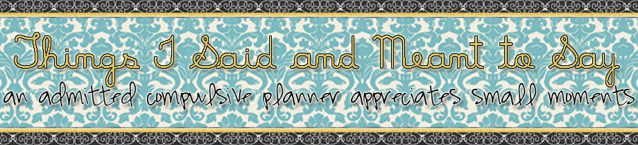

(Click on Banner to Enlarge)
Michelle contacted me after seeing the banner I did for The Date Girl Diaries. She only wanted a banner and matching button because she is teaching herself html/design and is working on her blog herself. Which I think is awesome, but I hope not too many people do that because then I wouldn't have a business! :) She asked for something simple with a lot of texture. She also told me she liked designs with damasks. So I took a blue damask background and edged it with a dark grey ribbon with a touch of gold. Then, I used a font she suggested for her title and a complimentary subtitle font. I really love how it turned out! Michelle is super sweet, and has a beautiful style of writing. I highly recommend checking our her blog.
P.S.-I will stop giving free services Sunday night, so if you are interested email me now!
Wednesday, July 21, 2010
The Date Girl Diaries
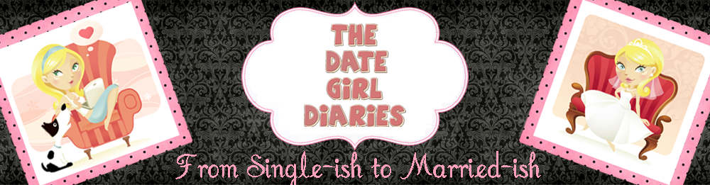
My blogging friend Date Girl from The Date Girl Diaries contacted me about making a new banner for her word press blog. Since I'm not familiar with word press, she just told me the size of the banner she wanted and she was able to install it herself. See in a small way, I can do word press! Then we had some problems figuring out how to install it because of pixel limits and word press issues. But we got it done! Honestly, word press will be next on the list of skills I want to learn.
She is getting married soon and she wanted something that could represent her transition from being single to married. So I helped her come up with the slogan, "From Single-ish to Married-ish." I used her old image she already had and she bought a similar wedding image. I love how the two pictures represent the old and the new. It was really fun working on a design for my blogging bff. So go check her out and give her some love!
Monday, July 19, 2010
Bloggishness

I also found out that Lydia lives in the same town in Texas where all my family lives, and we even got married at the same place. It is a small world after all!
Click on the picture above to check out Lydia's blog, Bloggishness.
Sunday, July 18, 2010
Joie of Life

P.S.-Have you gotten your free design yet? If not, e-mail me here!
Saturday, July 17, 2010
Soft Launch
OK guys, I'm just about ready to really launch Peachy Keen Design! But in the mean time, I'm offering free designs to get some more practice in. So if you would like your blogger blog designed for free drop me a line at brittanyervin86@yahoo.com
Subscribe to:
Posts (Atom)