Saturday, September 25, 2010

Little Houses-Pre-Made Layout

(Click on Image to See Live Preview)
I wanted to do a really simplistic, clean, and non-pink layout (non-pink is soooo hard for me, don't worry the pink will return soon enough). I wanted to make the header and the background of the layout look like they were connected, so I used the turquoise wallpaper for both.  I played around with the drop shadow on the elements (the house, tree, etc) to make them look a litle more 3D. I installed a custom font for the post, date, and sidebar title. Lastly, isn't the advertising button I made for this design super cute? I think it is the cutest one I've ever done. Its looks like a postage stamp! As always, if you purchased this layout I would replace the title "Little Houses" with your blog's title (as well as the other personalized elements).

I think the layout little houses could be used for so many different kind of blogs. To learn more about pre-made designs go here. To purchase e-mail me at brittanyervin86@yahoo.com.

Friday, September 17, 2010

Adam & Brittany

I created Adam & Brittany in conjunction with my personal blog, only because I wanted a way for my family and friends outside of California to keep up with us. And I do a lot of ranting and raving on my personal blog, and while it is not bad, I don't want all of my family to read my personal rants. Plus on Diary of B I just tell the funny stories in my life narrative style, and Adam and Brittany is more of just a way to scrapbook what is going on in our married life.

This blog design started out being Pink. Surprise, Surprise. But then I thought Adam wouldn't appreciate the pink, and I needed to break out of my pink comfort zone (which is hard, I LOVE PINK!) So I decided to do a brown theme. I love the brown paper wrapper feel of it as well. In the banner, I used a lot of homey elements like bird houses, white picket fences, and weather veins.(And I had to mention something about our dog Sarah!) 

I made a custom navigation bar with pages to info about us, our wedding, and our honeymoon (yeah, yeah gag you with a spoon, I KNOW. Our love sickens me too). And I used fun little paper strips for my side bar elements.

Some reason internet explorer is cutting my paper strips off and making them square, this makes me kind of sad. So view it in firefox people!

Tuesday, August 31, 2010

Tutorial: Removing/Changing the Border Around Images in Blogger Pt. 1

I've always hated the default border that blogger automatically adds to pictures, and I've had one or two people in the past ask me how I removed it. So I thought I would write a a short and easy tutorial on removing the border. I recently simplified the directions and added pictures. Look for the yellow circled elements. Click on Pictures to Enlarge.

Remove the Border
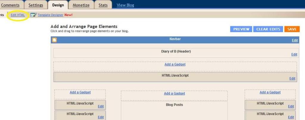
Step 1 and 2-Go to blogger's main page. Click the design tab under your blog's name (shown in pic 1). Then click the edit html tab (shown in pic two).
Picture 1
 Picture 2

Step 3-If you are on internet explorer go to the edit menu on your tool bar and click "find this item." (Or Hold down your Ctrl and your F key at the same time). Type in "img" on the box that pops up .  Keep clicking next until you find one of the codes that look similar to one of the two options below (you might have both). It may look slightly different than the options presented below (step shown in picture 3).

 Option 1-
  .post img {
  padding: 4px;
  }

Option 2- 
img{ padding: 4px;
}


Picture 3
 
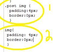
Step 4- Once you find the applicable code copy and paste "border:0px;" (without quotes) between the semi-colon and the }  symbol. The end result should look like this (step shown in pic 4):
post img {
  padding: 4px;
border:0px;
  }

Or this:
img{ padding: 4px;
border:0px;
}
Picture 4
5. Save your layout. That's it. 

Thursday, August 26, 2010

Jana K.

(Click on Image to see Live Preview)
I did this make-over for one of my best friends and former college roommate, Jana. Being that we are so close and I know her so well, figuring out what she wanted was super easy. She is obsessed with the 80's. She loves the music, fashion, and color schemes. So she told me that she wanted zebra print and bright colors!  So I gave her what else but zebra print and bright colors!

I made her blog title Jana K using my previously made and featured Autumn alpha by recoloring it. I found a really, really great blue and green design kit for the elements. I colored her background with a nice light blue and added a pink border. This layout is pretty simple but really, really fun. 

So go check out Jana's blog, she is the best friend a girl could have. Love you chickadee!

Tuesday, August 24, 2010

Hey There Delilah-Pre Made Layout

Click on Image to See Live Preview
Hey There Delilah is my new favorite design. I had the idea that I wanted to do an atypical blogger layout. One that didn't have visible designated sections. Like you can't see where the header ends and the post area begins. Everything is just floating in a sea of black. Lame analogy, I know! This layout would be great for anyone living in the city, or anyone who just loves the city. Although I think it can be used for a variety of purposes.

I named it Hey There Delilah because that is one of my favorite songs. It was mine and my husband's song when we were in a long distance relationship, and it just reminds me of my own life as a country bumpkin turned city girl. To learn more about pre-made designs go here. To purchase e-mail me at brittanyervin86@yahoo.com

Thursday, August 19, 2010

Pre-Made Layout-Paparazzi

(Click on Image to See a Live Preview)
I created Paparazzi during my three day internet drought. Believe me,  I had nothing to do but fool around with photoshop. But I love fooling around on photoshop, so I didn't really care. I didn't have any inspiration for Paparazzi ,except that I wanted to do something bright and fun. I added pops of color all over the layout and used a mesh mash of different things in the banner. The banner really reminded me of Lady Gaga for some reason. So that is how I came up with the name Paparazzi (after one of her songs). Since I came up with the name Paparazzi, I've had "Ra Ra Oh Ma Ma, Ga Ga Um Ba Rar,"stuck in my head. Which isn't even the correct song. Nope, that song is called Bad Romance.

I've used the effect of having different colored sidebars in the past.  But it is an effect that I really love. It just makes the sidebars stand out a little more. I used a little creased heart for the sidebar titles and the favicon. I also really love the button I made to match this layout. I think you guys would really have a lot of fun with this layout. To learn more about pre-made layouts go here. To purchase or ask questions e-mail me at brittanyervin86@yahoo.com.

Wednesday, August 18, 2010

Pre-Made Layout-Autumn (plus free alpha)

(Click on Image to See Live Preview)
You have no idea how much free time I had this week. So much so  that I actually created three full layouts, and I will hopefully roll out the last one tomorrow. This one is called Autumn. I wanted to keep it really simple and clean. I love how all the elements look like actual paper. I installed a custom font in the sidebar and post titles that match the font in the header. I also added the birds to the widgets because they just add a really cute element. I used the tree line image in the banner and also as an image to divide posts.

This is a three-columned layout (can be changed). But this is the first layout I showcased that has both columns to the right. I wanted to give you guys an idea of what that kind of layout actually looks like.  To learn more about pre-made layouts go here. To purchase email me at brittanyervin86@yahoo.com.
I also created an alpha to go along with Autumn.  It is uppercase letters only and has some non-letter symbols. For CU,  PU, S4H, and S4O. No credit for use is necessary. Just drop me a comment if you use it, makes me happy. Download here.
 

Design by Peachy Keen Design